Accessibility - Basic tips to make your site more accessible
02 Oct 2018In this post I present some basic tips I’ve learnt about accessibility (a11y).
Disabilities
When we talk about disabilities people usually think about visual disabilities, even though visual disabilities are the most common there are other types and even different levels of them:
- Total blindness.
- Partial blindness.
- Color blindness.
- Dyslexia
- Motor disability
Buttons and links
When designing buttons and links lots of its meaning is composed by the context around, not only the text inside it.
In the example below it is clear for us that the Delete action is related to the Mascara product. We can make this
link because the visual arrangment of the elements given they are in the same table’s row.
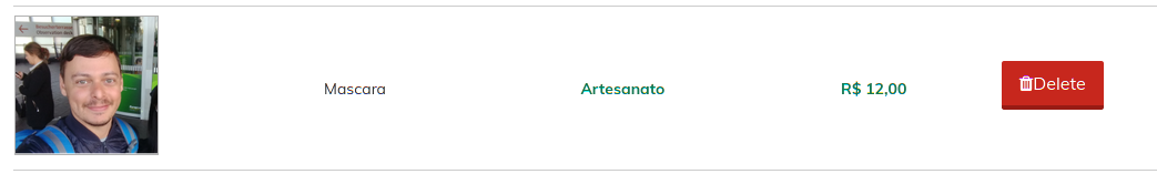
However it is not that clear to a blind person, in this case we could make it more explicit by adding more information and at the same time keeping the same layout for people who can see:
<button>Delete<span class="sr-only"> Mascara</span></button>
Being sr-only like:
.sr-only {
  display: none;
}
So the product name would be available to screen readers but not visually.
Another way to achieve this is using the aria-label attribute, for instance imagine we have a close button
with an X as content. In this case we don’t want to complement the information as the information is only
a X letter that works more as an icon than a text, so we can set a aria-label to this button instead.
<button aria-label="close current dialog" onclick="myDialog.close()">X</button>
Forms and inputs
Creating accessible forms and inputs is not that difficult when you follow the default guidelines.
Always use label
The label tag combined with for attribute is the recomendation when naming inputs. Some people like
using placeholder to replace labels but they are not intended to be used like that. Placeholders should
only be used as example values.
<label for="user_name">Name:</label>
<input id="user_name" name="user[name]" placeholder="Andrew S Aguiar" />
If you want to simulate the placeholder as label approach you can do something like:
<div class="placeholder-container">
  <input class="placeholder-input" type="text" id="user_name" />
  <label class="placeholder-label" for="user_name">User Name</label>
</div>

<style>
.placeholder-container {
  position: relative;
}
.placeholder-label {
  position: absolute;
  top: 0;
  left: 1em;
}
.placeholder-input {
  padding: 1em;
}
.placeholder-input:focus + .placeholder-label {
  display: none;
}
.placeholder-input:not(:placeholder-shown) + .placeholder-label {
  display: none;
}
</style>
The magic here is using the sibling operator + and a :not(:placeholder-shown) selector so we hide the
floating label when input is not empty and on focus.
Images
That’s a very basic tip but it is a worthy always remember, always use the alt attribute in images, alt gives
a textual description of the image that will be read by the screen reader.
<img src="image.png" alt="table with one row with product photo, name and a delete button red" />
Skip to content button
Some disabilities can make it impossible for the user to use a mouse or any other pointing device (pens, trackpads). In these case people use the keyboard (tab, tab, tab) to move across the page.
When page has a top menu header the user will need to pass through all links before reaching the content, to avoid this
we can implement a skip to content link as the first focusable element.
Basically we create a link before the menu, make it position: absolute and left: -999px; to hide it and set
left: 5px when in focus (so the button only appear when use focus on it). And the most important set an href as
the main container id to make the magical skip.
Simple isn’t it =)
<style>
.skip-to-content {
  position: absolute;
  top: 5px;
  left: -999px;
  border: 2px solid blue;
  background-color: white;
  padding: 8px;
  color: #333333;
}

.skip-to-content:focus {
  left: 5px;
}
</style>

<body>
  <a class='skip-to-content' href='#content'>
    Skip to content
  </a>

  <header>
    ...Menu
  </header>

  <main id='content'>
    ...
  </main>
</body>
Typography
Typography is a very important part of your accessible design, it is important to keep fonts consistent, letter spacing and line height good as it has an impact in readability. Also for people with dyslexia it is important as well:
- Avoid justified text, as uneven spaces between words can make it confusing to read.
- Avoid italic, underscore and capital letters when stressing text, prefer bold.
- Avoid too big paragraphs.
Ensure keyboard navigation works
All focusable elements already have a tabbing order based on its order in html, but n some cases
it is better to change it a little bit, to do this we can use the tabindex attribute
- tabindex=0 makes the element tabbable.
- tabbable=-1 makes the element untabbable.
- tabbable=N being N a positive number makes the element tabbable and sets the order on it.
<div tabindex="0">Tabbable due to tabindex.</div>

<input tabindex="-1" placeholder="cannot be tabbed" />

<p>Tab sequence below is reversed due tabindex 3, 2, 1</p>
<div tabindex="3">Tabbable due to tabindex 3.</div>
<div tabindex="2">Tabbable due to tabindex 2.</div>
<div tabindex="1">Tabbable due to tabindex 1.</div>
Never suppress outline
Following the idea of tabbing consistency, focus trap and skip to content tips other tip is never suppress outline in focusable elements. All browsers have a default style (normally a glowing blue line) to focusable elements when they are on focus. Some people like to remove it because it does not follows the site style. By doing this you are removing the visual indication of where the focus is and making the life of users with motor disabilities harder. My sugestion in this case is try to customize, never remove it totally.
References
- Web Accessibility Initiative: www.w3.org/WAI
- Accessibility linter CLI tool: addyosmani.com/a11y